2025
Rena
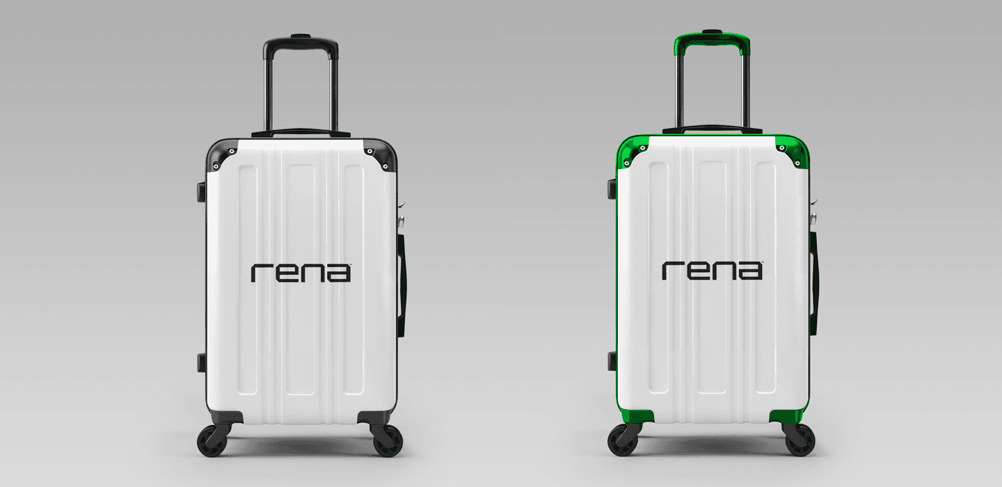
Project Overview Client: Rena (Fashion Brand) Project Type: Product & Brand Design (Brand Identity, Digital Touchpoints, Visual System) Goal: Build a cohesive product-driven brand system that aligns Rena’s visual identity with its digital experience, making the brand intuitive, consistent, and scalable across product and marketing touchpoints.
Brand Identity/Guidelines
Design
Problem Statement Rena lacked a unified connection between its brand identity and its digital product experience. While the brand aimed to appear premium and modern, users encountered inconsistent visuals and unclear hierarchy across touchpoints, reducing trust and memorability®
Key Problems:
Brand visuals were not consistently reflected in digital product interfaces
Users could not clearly recognize or recall the brand across platforms
No design system existed to guide product, marketing, and growth teams
Research & Discovery
Conducted competitor analysis across fashion brands and e-commerce products
Reviewed user behavior patterns on fashion websites and social platforms
Identified user expectations around clarity, aesthetics, and ease of navigation
Defined core brand principles: modern, confident, accessible, and style-forward
Strategy & Approach.
Mapped brand attributes to product experience goals
Defined how tone, color, typography, and spacing should translate into UI decisions
Concept Development
Explored multiple visual directions focused on clarity, elegance, and usability
Created mood boards connecting brand emotion with product interaction patterns
Design System Creation
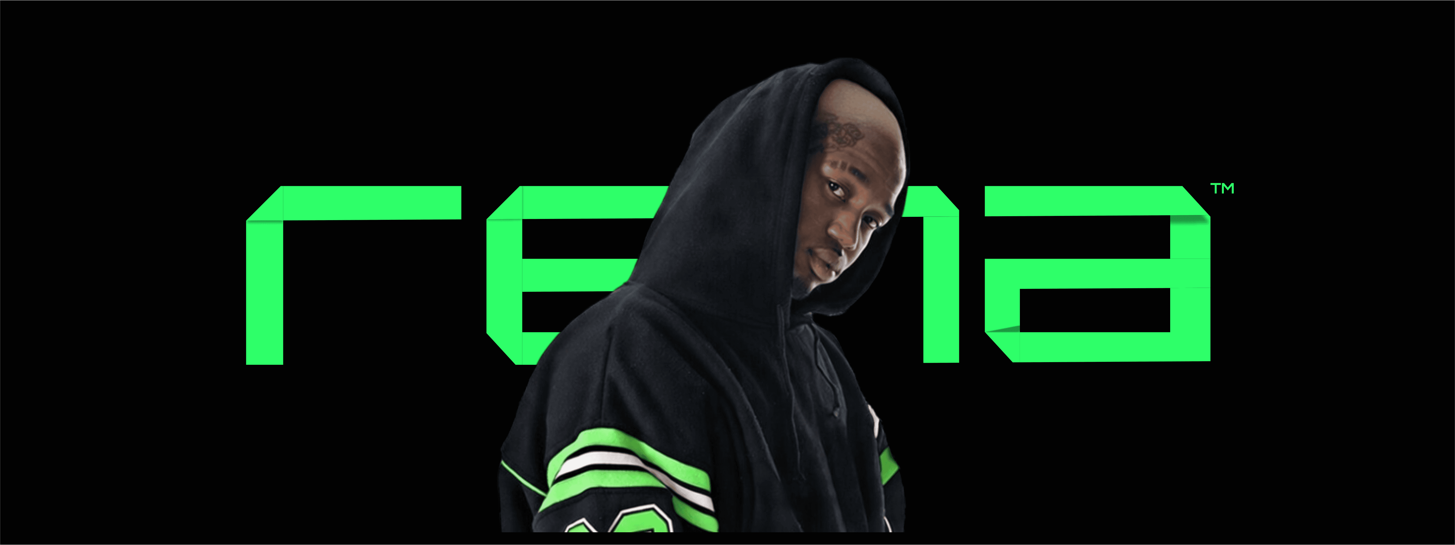
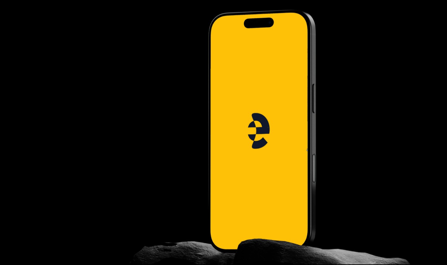
Designed a flexible logo and visual identity optimized for digital products
Built a scalable typography hierarchy for both brand communication and UI
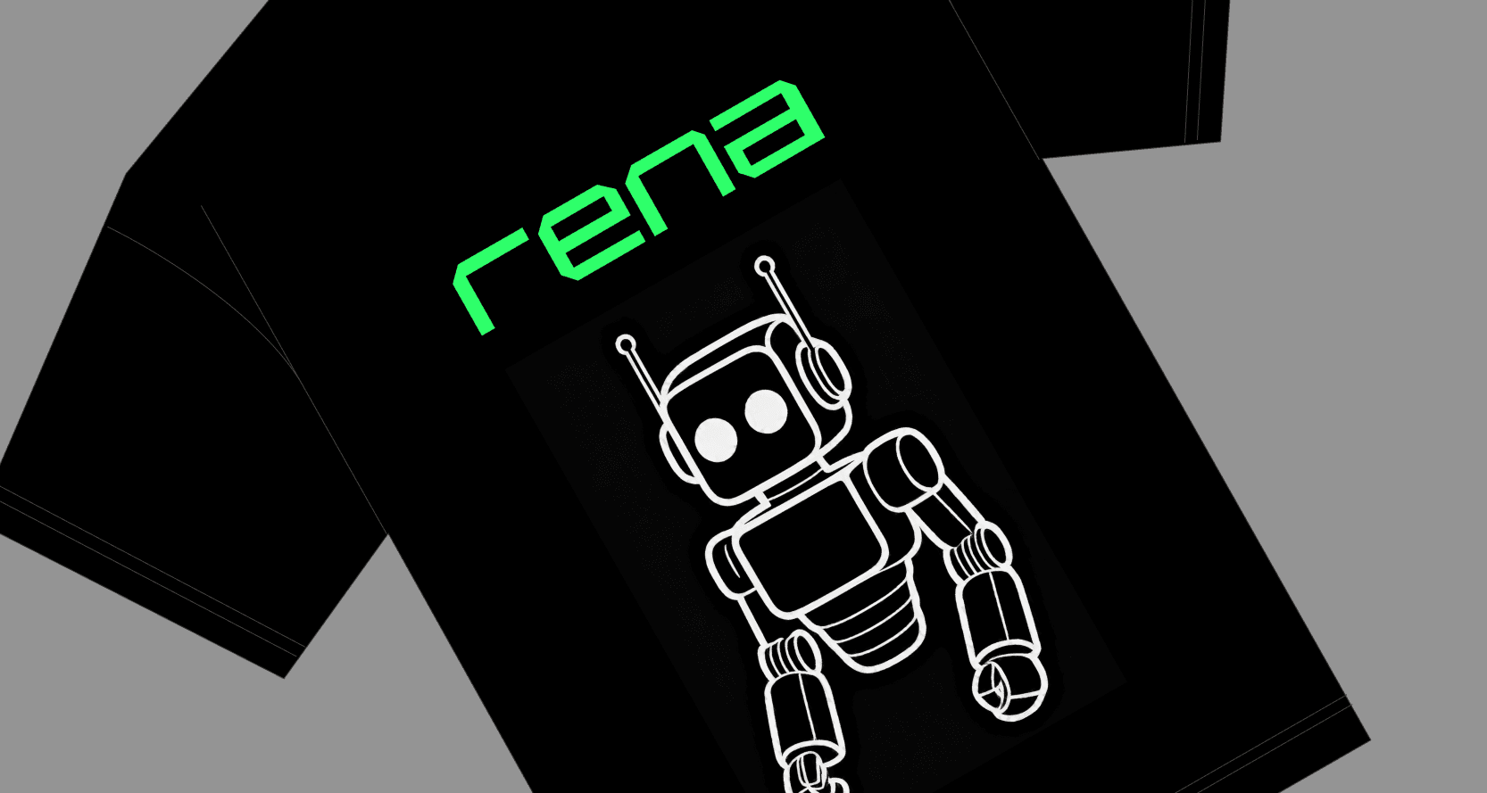
Brand Identity System (logo, color, typography)
Product-ready Design System
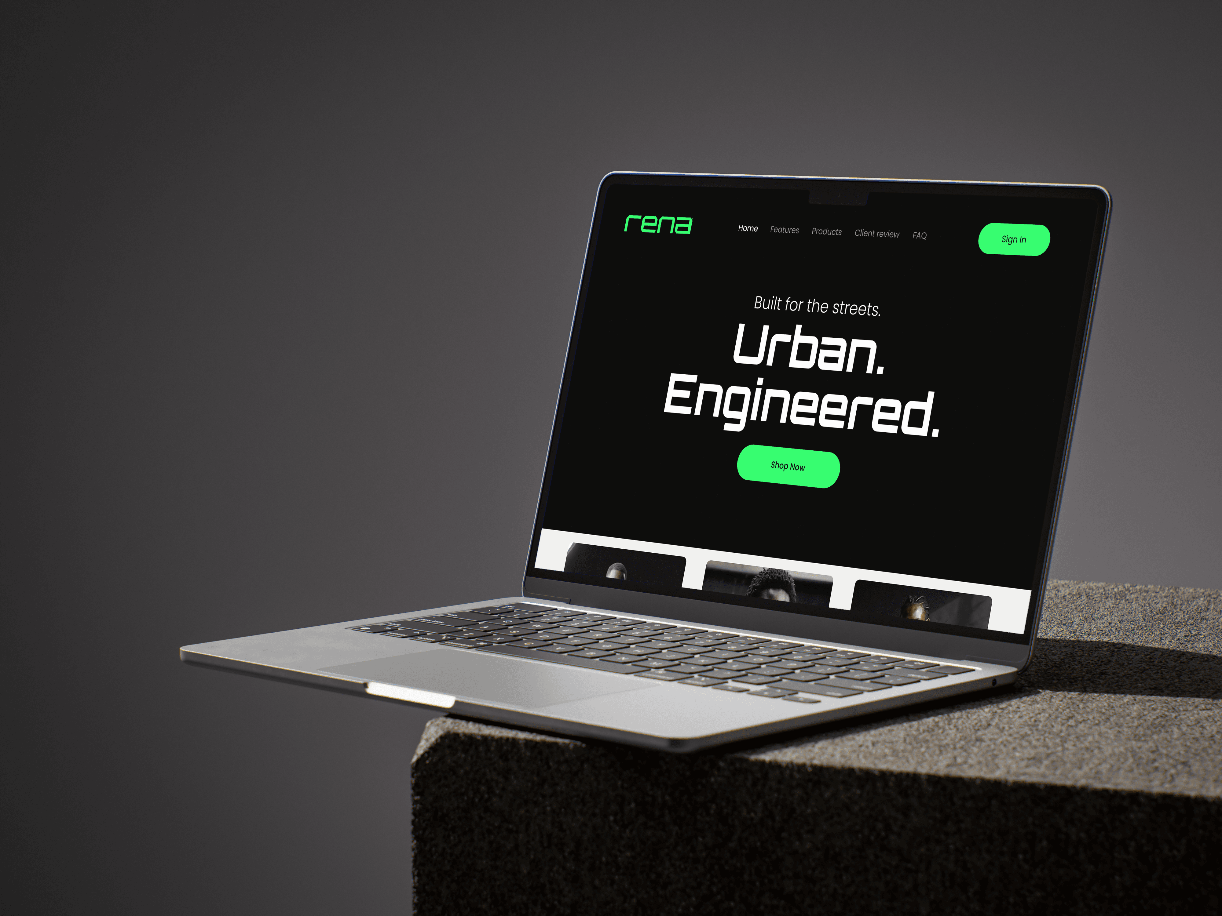
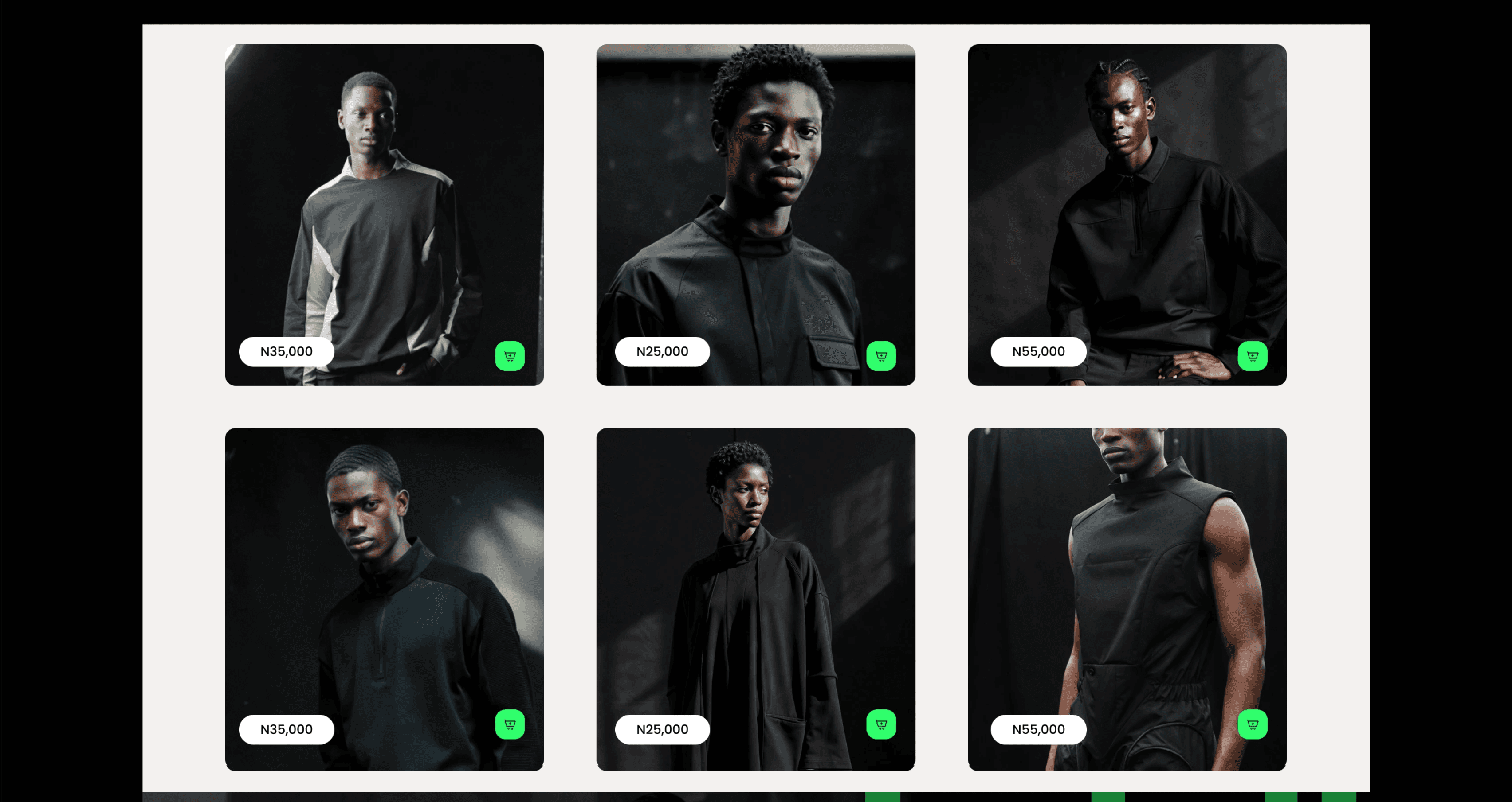
UI layouts for key digital touchpoints
Brand and product usage guidelines
Impact & Outcomes
(Post-Launch / Estimated)
+21% improvement in website conversion rate due to improved visual hierarchy and product clarity
+18% increase in repeat visits as users became more familiar with the brand experience
−25% reduction in design turnaround time after introducing a reusable brand–product design system
Improved brand recall, with users able to identify Rena across platforms after fewer touchpoints
Strategic Outcomes:
Improved brand recognition across digital channels
Clearer visual hierarchy and improved usability in product interfaces
Reduced friction for future product and marketing design updates
Positioned Rena as a modern, trustworthy, and scalable fashion brand.
Reflection & Learnings
This project reinforced the importance of treating branding as part of the product experience—not just visual styling. Aligning brand strategy with product design resulted in a more coherent, usable, and impactful user experience.
This project reinforced several key learnings at the intersection of product and brand design:
Branding works best when treated as part of the product, not a layer added on top. Translating brand principles directly into UI decisions (spacing, hierarchy, color roles, and components) created a more intuitive experience.
A shared design system became a growth enabler. By aligning brand and product teams around one system, design decisions became faster, more consistent, and easier to scale.
Visual consistency directly impacts user trust and conversion. Clear hierarchy and recognizable brand patterns reduced cognitive load and helped users navigate and make decisions faster.
Designing with business outcomes in mind (conversion, engagement, efficiency) strengthened the case for design as a strategic function rather than a purely aesthetic one.
(GQ® — 02)
©2024

FAQ
01
What does a project look like?
02
How is the pricing structure?
03
Are all projects fixed scope?
04
What is the ROI?
05
How do we measure success?
06
What do I need to get started?
07
How easy is it to edit for beginners?
08
Do I need to know how to code?
2025
Rena
Project Overview Client: Rena (Fashion Brand) Project Type: Product & Brand Design (Brand Identity, Digital Touchpoints, Visual System) Goal: Build a cohesive product-driven brand system that aligns Rena’s visual identity with its digital experience, making the brand intuitive, consistent, and scalable across product and marketing touchpoints.
Brand Identity/Guidelines
Design
Problem Statement Rena lacked a unified connection between its brand identity and its digital product experience. While the brand aimed to appear premium and modern, users encountered inconsistent visuals and unclear hierarchy across touchpoints, reducing trust and memorability®
Key Problems:
Brand visuals were not consistently reflected in digital product interfaces
Users could not clearly recognize or recall the brand across platforms
No design system existed to guide product, marketing, and growth teams
Research & Discovery
Conducted competitor analysis across fashion brands and e-commerce products
Reviewed user behavior patterns on fashion websites and social platforms
Identified user expectations around clarity, aesthetics, and ease of navigation
Defined core brand principles: modern, confident, accessible, and style-forward
Strategy & Approach.
Mapped brand attributes to product experience goals
Defined how tone, color, typography, and spacing should translate into UI decisions
Concept Development
Explored multiple visual directions focused on clarity, elegance, and usability
Created mood boards connecting brand emotion with product interaction patterns
Design System Creation
Designed a flexible logo and visual identity optimized for digital products
Built a scalable typography hierarchy for both brand communication and UI
Brand Identity System (logo, color, typography)
Product-ready Design System
UI layouts for key digital touchpoints
Brand and product usage guidelines
Impact & Outcomes
(Post-Launch / Estimated)
+21% improvement in website conversion rate due to improved visual hierarchy and product clarity
+18% increase in repeat visits as users became more familiar with the brand experience
−25% reduction in design turnaround time after introducing a reusable brand–product design system
Improved brand recall, with users able to identify Rena across platforms after fewer touchpoints
Strategic Outcomes:
Improved brand recognition across digital channels
Clearer visual hierarchy and improved usability in product interfaces
Reduced friction for future product and marketing design updates
Positioned Rena as a modern, trustworthy, and scalable fashion brand.
Reflection & Learnings
This project reinforced the importance of treating branding as part of the product experience—not just visual styling. Aligning brand strategy with product design resulted in a more coherent, usable, and impactful user experience.
This project reinforced several key learnings at the intersection of product and brand design:
Branding works best when treated as part of the product, not a layer added on top. Translating brand principles directly into UI decisions (spacing, hierarchy, color roles, and components) created a more intuitive experience.
A shared design system became a growth enabler. By aligning brand and product teams around one system, design decisions became faster, more consistent, and easier to scale.
Visual consistency directly impacts user trust and conversion. Clear hierarchy and recognizable brand patterns reduced cognitive load and helped users navigate and make decisions faster.
Designing with business outcomes in mind (conversion, engagement, efficiency) strengthened the case for design as a strategic function rather than a purely aesthetic one.
(GQ® — 02)
©2024
FAQ
01
What does a project look like?
02
How is the pricing structure?
03
Are all projects fixed scope?
04
What is the ROI?
05
How do we measure success?
06
What do I need to get started?
07
How easy is it to edit for beginners?
08
Do I need to know how to code?
2025
Rena
Project Overview Client: Rena (Fashion Brand) Project Type: Product & Brand Design (Brand Identity, Digital Touchpoints, Visual System) Goal: Build a cohesive product-driven brand system that aligns Rena’s visual identity with its digital experience, making the brand intuitive, consistent, and scalable across product and marketing touchpoints.
Brand Identity/Guidelines
Design
Problem Statement Rena lacked a unified connection between its brand identity and its digital product experience. While the brand aimed to appear premium and modern, users encountered inconsistent visuals and unclear hierarchy across touchpoints, reducing trust and memorability®
Key Problems:
Brand visuals were not consistently reflected in digital product interfaces
Users could not clearly recognize or recall the brand across platforms
No design system existed to guide product, marketing, and growth teams
Research & Discovery
Conducted competitor analysis across fashion brands and e-commerce products
Reviewed user behavior patterns on fashion websites and social platforms
Identified user expectations around clarity, aesthetics, and ease of navigation
Defined core brand principles: modern, confident, accessible, and style-forward
Strategy & Approach.
Mapped brand attributes to product experience goals
Defined how tone, color, typography, and spacing should translate into UI decisions
Concept Development
Explored multiple visual directions focused on clarity, elegance, and usability
Created mood boards connecting brand emotion with product interaction patterns
Design System Creation
Designed a flexible logo and visual identity optimized for digital products
Built a scalable typography hierarchy for both brand communication and UI
Brand Identity System (logo, color, typography)
Product-ready Design System
UI layouts for key digital touchpoints
Brand and product usage guidelines
Impact & Outcomes
(Post-Launch / Estimated)
+21% improvement in website conversion rate due to improved visual hierarchy and product clarity
+18% increase in repeat visits as users became more familiar with the brand experience
−25% reduction in design turnaround time after introducing a reusable brand–product design system
Improved brand recall, with users able to identify Rena across platforms after fewer touchpoints
Strategic Outcomes:
Improved brand recognition across digital channels
Clearer visual hierarchy and improved usability in product interfaces
Reduced friction for future product and marketing design updates
Positioned Rena as a modern, trustworthy, and scalable fashion brand.
Reflection & Learnings
This project reinforced the importance of treating branding as part of the product experience—not just visual styling. Aligning brand strategy with product design resulted in a more coherent, usable, and impactful user experience.
This project reinforced several key learnings at the intersection of product and brand design:
Branding works best when treated as part of the product, not a layer added on top. Translating brand principles directly into UI decisions (spacing, hierarchy, color roles, and components) created a more intuitive experience.
A shared design system became a growth enabler. By aligning brand and product teams around one system, design decisions became faster, more consistent, and easier to scale.
Visual consistency directly impacts user trust and conversion. Clear hierarchy and recognizable brand patterns reduced cognitive load and helped users navigate and make decisions faster.
Designing with business outcomes in mind (conversion, engagement, efficiency) strengthened the case for design as a strategic function rather than a purely aesthetic one.
©2024
FAQ
What does a project look like?
How is the pricing structure?
Are all projects fixed scope?
What is the ROI?
How do we measure success?
What do I need to get started?
How easy is it to edit for beginners?
Do I need to know how to code?